
Data Visualizations
Using Graph View
Click the Graph tab to switch to visualization mode. You can configure:
- Type: choose between Timeseries, Counts, Treemap, or Connection map
- Field: the dimension to break down (e.g., Src country, Destination port, URI path, Protocol)
- Results: how many top values to show (e.g., top 10)
- Interval: time bucket size for timeseries charts
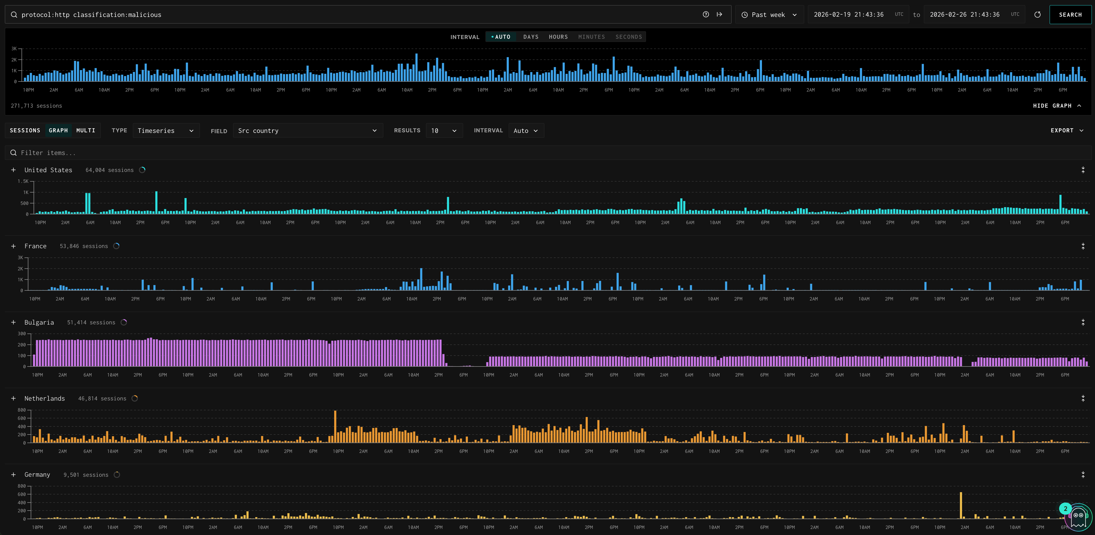
Timeseries
Shows session volume over time, broken out by your selected field. Each value (e.g., each source country) gets its own chart row, making it easy to spot which countries or IPs are responsible for traffic spikes.
You can drill deeper by adding a secondary field using the "+" icon on the top right of the chart. This breaks each primary value's chart row down further by the secondary field. For example, with Field set to Src country and a secondary field of Protocols, Switzerland's chart row expands to show separate timeseries for http sessions and tcp sessions within that country — so you can see not just when Switzerland spiked, but what protocol drove it.
- Click the + icon next to any row label to expand that value and see the secondary breakdown
- Click the × icon to collapse it back
- Each top-level row shows the total session count for that value alongside the label
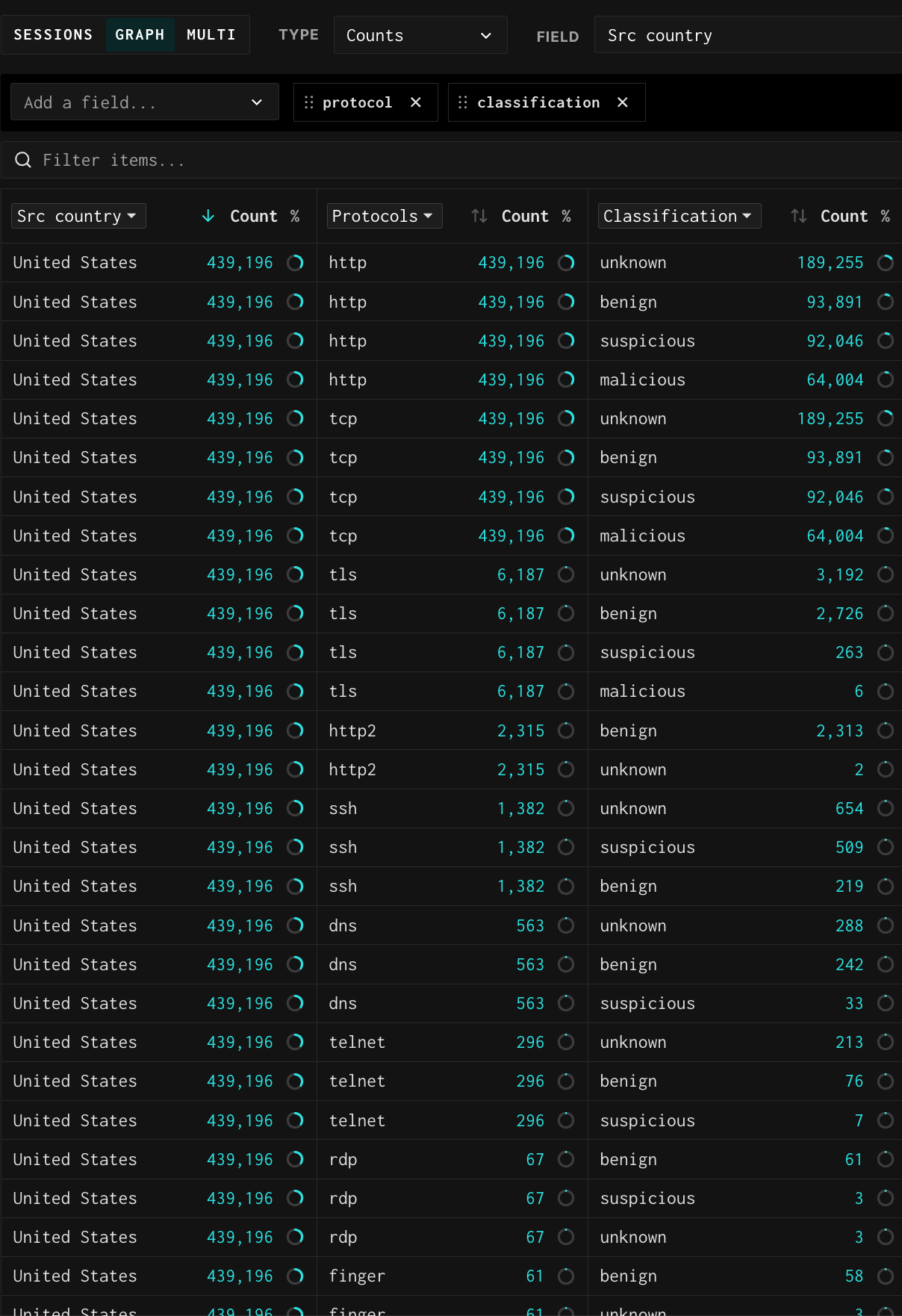
Counts
Shows a ranked table of unique values for your selected field with session counts and percentage of total. The circle icon next to each count lets you click to drill into that value and append it to your query.
Add a secondary field using the "Add a field" dropdown to create a cross-tabulation view. This adds a second set of columns to the right showing how each primary value breaks down by the secondary field. For example, Field: Src country with a secondary field of Classification shows each country's total session count in the left columns and then lists that country's session counts by classification (unknown, malicious, benign, suspicious) in the right columns. Each primary value repeats as a row for each secondary value it contains.
- Use the search box to narrow the table to specific values
- Click the sort arrows on either Count column to re-rank by primary or secondary count
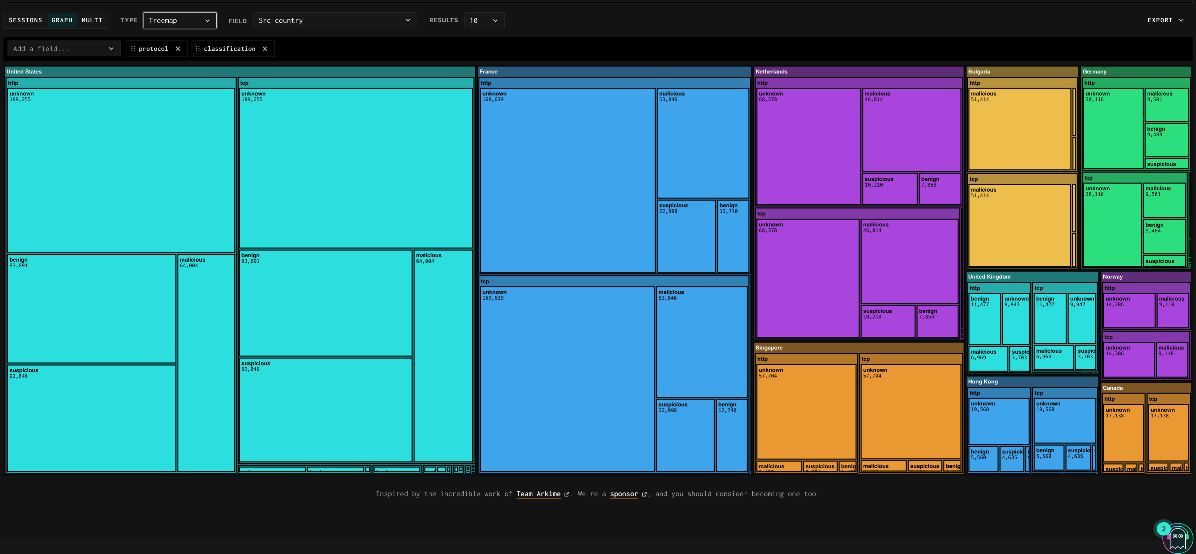
Treemap
Visualizes relative proportions across all values using colored rectangles — each value gets a uniquely colored block sized by session count. Great for seeing country distribution, protocol mix, or port distribution at a glance.
Add a secondary field using the "Add a field..." dropdown to nest a second dimension inside each primary block. For example, Field: Src country with a secondary field of Classification breaks each country block into sub-blocks colored by classification — so the Netherlands block might show a large unknown sub-block and a smaller malicious sub-block, while Hong Kong shows mostly malicious. This makes it immediately obvious which countries are contributing the most malicious or unknown traffic.
- Hover over any block to see the exact session count in a tooltip
- Click any block to drill into that value and append it to your query
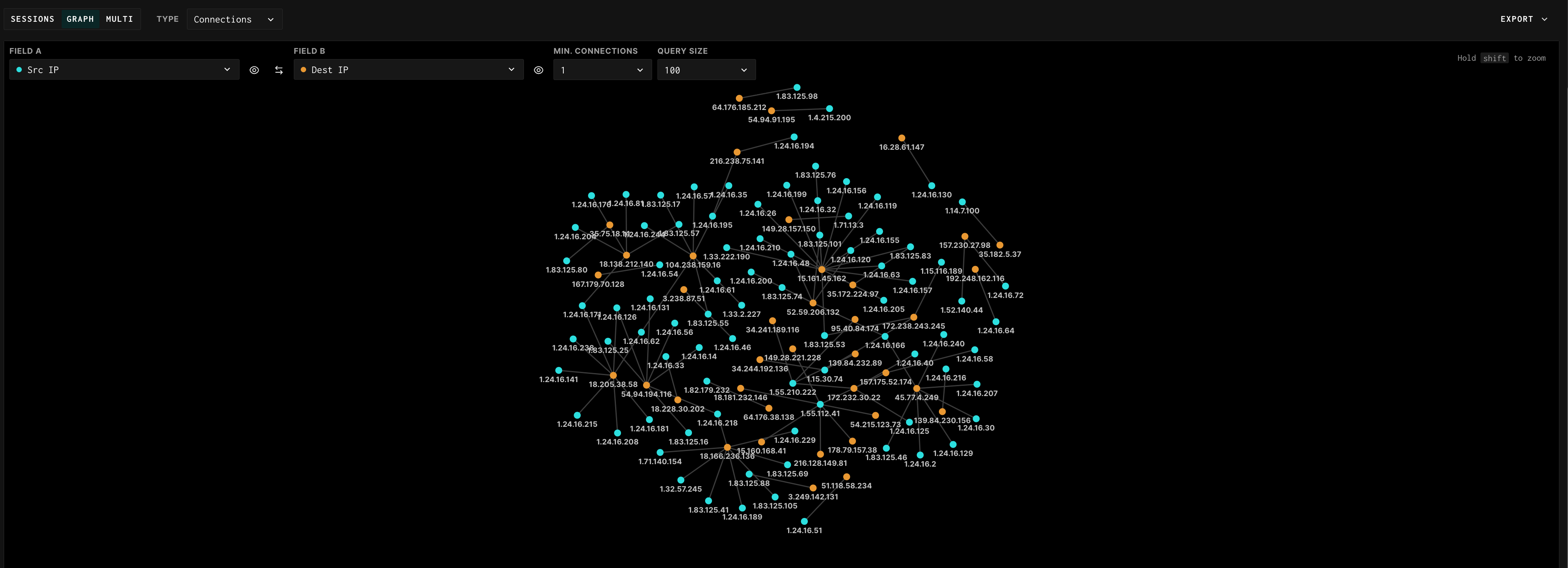
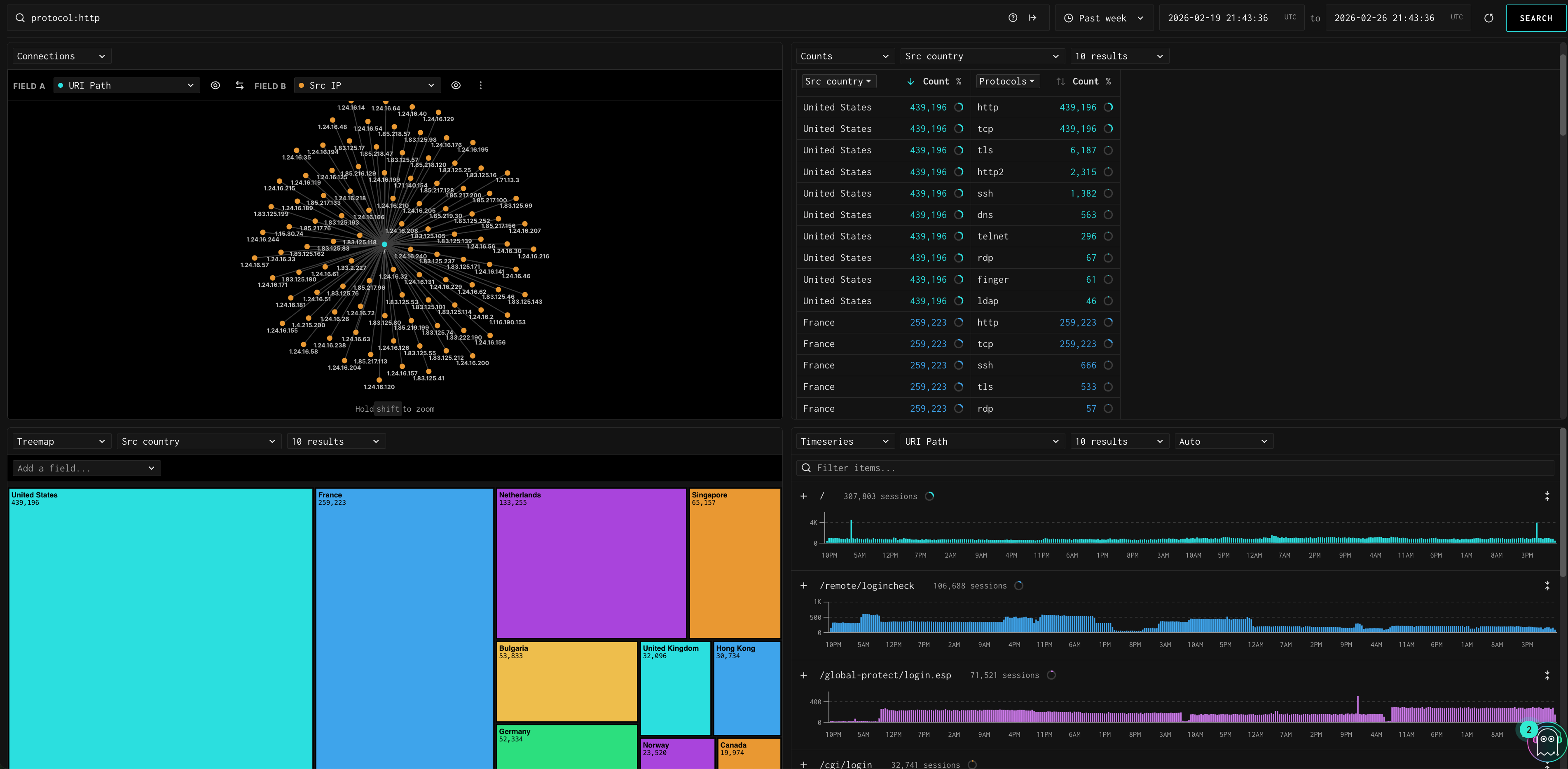
Connections
Shows a network graph of relationships between two fields. Configure Field A (e.g., Src IP) and Field B (e.g., Dest IP) to see which source IPs are connecting to which destination IPs. Additional controls:
- Min. Connections: filters out edges with fewer than N connections, reducing noise
- Query Size: how many nodes to include in the graph (e.g., top 100)
- Hold Shift to zoom into a region of the graph
- Click any node to highlight its connections and filter the view
- Swap Field A and Field B using the swap arrow to reverse the direction of analysis
- The eye icon next to each field lets you toggle node labels on/off
Multi View
Click the Multi tab to open a 2x2 or 2x1 dashboard. You can configure each quadrant independently with a different field and chart type. This is useful when you want to monitor several dimensions simultaneously, for example: URI paths (timeseries) alongside source countries (counts), protocol distribution (treemap), and another URI path breakdown.
Exporting Aggregated Data
From Graph views, use the Export button (located on the top right) to download a JSON of the aggregated data. For example, you can export the full list of unique source IPs or source countries matching your query for use in an external workflow.
Updated 3 months ago